It's always fun to receive translations of my books in the mail, or even to find a new translation on one of Harlequin's foreign websites. Sometimes they carry the same cover as the original publication, but even these look new and shiny with the office's own cover treatment. Other times they come dressed in different cover art and I asked the Managing Editor of Harlequin Australia, Jackie Johnson, about the how and why of cover art selection. Here's what the always-helpful Jackie had to say.
"We have a data-base that is open to all of the overseas offices which holds every artwork commissioned for series books. We can, and do, use different artwork when we need to -- this can happen if the artwork commissioned for a particular title is unsuitable, or when we use single title product in the series line, etc. These would be chosen (usually) by marketing after an art brief has been supplied by an editor. In the case of our office, I am in essence, both editor and marketing function for covers, so I take care of this.
Whilst this happens on a couple of titles each month, I order the artwork commissioned for the specific title for the majority of titles from North America or the UK. For duo books I order the most appealing image of the two titles. The only art we select locally from stock photo-libraries appear on Sexy Sensations and Ultimate Collections. These are generic images and are sourced monthly. The only artwork we order from the UK offices are Medical.
Each overseas office has a different art strategy depending on how that particular series performs in their market (eg. The UK use more photographic images on certain series, the French design from scratch for a more sophisticated look etc.)"
It is fun and especially delightful when one of the foreign offices chooses a cover image which captures the characters or the book's tone better than the original. When the cover art is recognisable -- for example, because it's been featured on the cover of a good friend's book or because it's been staring at me from the cover of a favourite on my keeper's shelf -- then that can be slightly strange...but still fun in a different way.
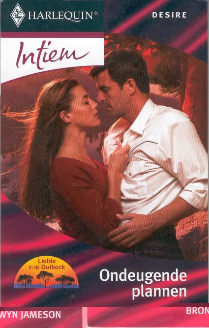
Last week I received copies of the Dutch translations of my
Princes of the Outback trilogy, beautifully packaged as a single and a duo under the flag of
Love in the Outback. The cover of
The Rugged Lover (left, below) is beautiful. This could
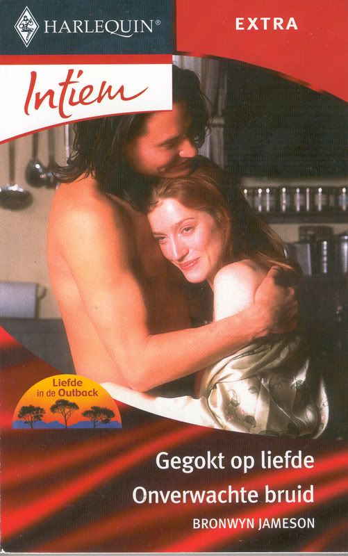
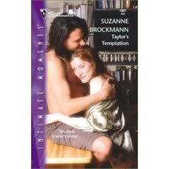
be Tomas and Angelina. I love it! Next I looked at the duo cover (centre, below) and didn't need to check my keeper's shelf. This is the cover originally used on
Taylor's Temptation, Suzanne Brockmann, from 2001-ish. (I'm kinda glad the shorts are cut from mine! *g*)


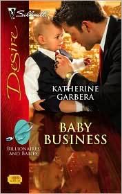
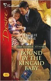
Recently my
Bought-And-Paid-For Wife came out in the UK, using the original cover art from the other book in the duo, Patricia Kay's
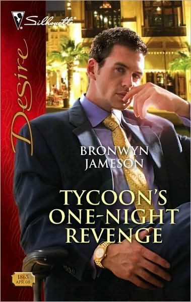
One-Week Wife. My book's art was used the same month on another Desire Duo, and I have to say it was funny seeing "my" cover on another book (see right).

When another author sent me a link to the German site, where
Bought-And-Paid-For Wife is a September release, my eyes were drawn to another familiar cover. First seen on Trish Morey's
Virgin For The Taking, this is one of my favourite romantic covers -- and one of my favourites of Trish's wonderful books -- which is why it caught my eye. This time around it's gracing Pat Kay's
One-Week Wife and the couple are walking a romantic stretch of Mexican beach, rather than Broome, Western Australia, as in Trish's book. Wherever that beach is, it's gorgeous, isn't it?
Covers, they do get around. *g*
Do you have any favourite cover images which do a fabulous job of depicting the characters and the story inside the book?
 This morning I picked up my alphasmart (a battery-operated word processor) and headed out into the garden to write this blog. At my side is a list of possible topics...which I have decided to ignore. Instead I am taking time out to enjoy this perfect spring day.
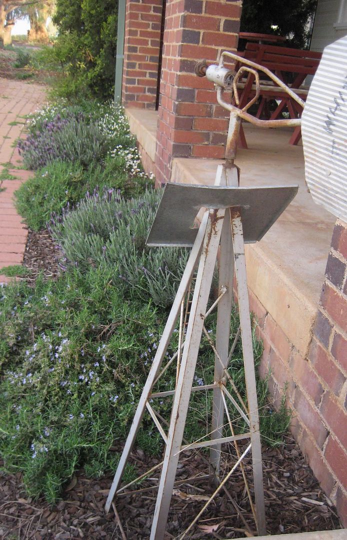 I will do nothing more strenuous than pulling a few weeds and whisking the batter to make banana pancakes for brunch. Later I will bring my book outside. I'm reading a gently nostalgic story about the importance of family bonds, and about how we can lose understanding of our family if we don't take the time to sit and talk and listen. It's a story of hope and rejuvenation, simply and warmly told, and that seems like the perfect read on a day like today.
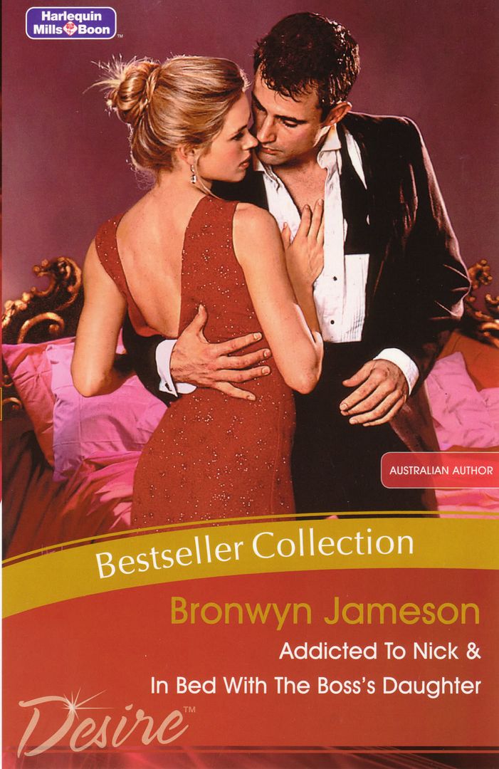 How are you spending your weekend?